Our Brand
THE CONCEPT
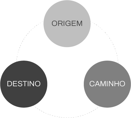
The ATEM brand was designed based on the concept of distribution, representing the process: origin, path and destination.
The circular elements characterize the particles of its main product, the gasoline, arranged in a way to symbolize growth, development and distribution, through progressive movement from left to right, starting at one point and multiplying at several others. Throughout this process, the circular elements increase in size, which symbolizes the expansion of the company.


TYPOLOGY
The ATEM typology was designed specifically for the proposal, which reinforces our own identity.

OUR COLLORS
The brand colors reinforce the concept designed for its development. Yellow, which carries values such as knowledge and optimism, generates the perfect contrast with red, which adds values of solidity, modernity and satisfaction.
KNOWLEDGE
OPTIMISM
CONTRAST
SOLIDITY
MODERNITY
SATISFACTION
- SOLIDEZ
- MODERNIDADE
- SATISFAÇÃO
